Paris Roubaix
Updated for the 2021 edition
Below you can find all sorts of historical Paris Roubaix cycling statistics. Over time this page will be expanded and improved with more cycling statistics and visualizations. If you are interested in cycling betting don’t forget to check out our predictions page. The 2021 Paris Roubaix predictions will be published once the startlist is (almost) final.
Most figures and tables below should be self explanatory. For some we provide some additional explanation. If you still have questions don’t hesitate to send us a tweet or email.
Quick Facts
- date
-
Sunday April 11, 2021
- country
-
- edition
-
119th
- class
-
1.UWT
- length
-
NA kilometers
-
@Paris_Roubaix
- website
-

Paris Roubaix 2021 profile(s) and route
Previous top 10’s
| # | 2019 |
|---|---|
| 1 | Philippe Gilbert |
| 2 | Nils Politt (+0 s) |
| 3 | Yves Lampaert (+13 s) |
| 4 | Sep Vanmarcke (+40 s) |
| 5 | Peter Sagan (+42 s) |
| 6 | Florian Sénéchal (+47 s) |
| 7 | Mike Teunissen (+47 s) |
| 8 | Zdeněk Štybar (+47 s) |
| 9 | Evaldas Šiškevičius (+47 s) |
| 10 | Sebastian Langeveld (+47 s) |
Most top 10 classifications
Figure 2: Paris Roubaix top 10 positions since 2012. Only the top 20 riders is shown.
Top 20 Riders with most DNF
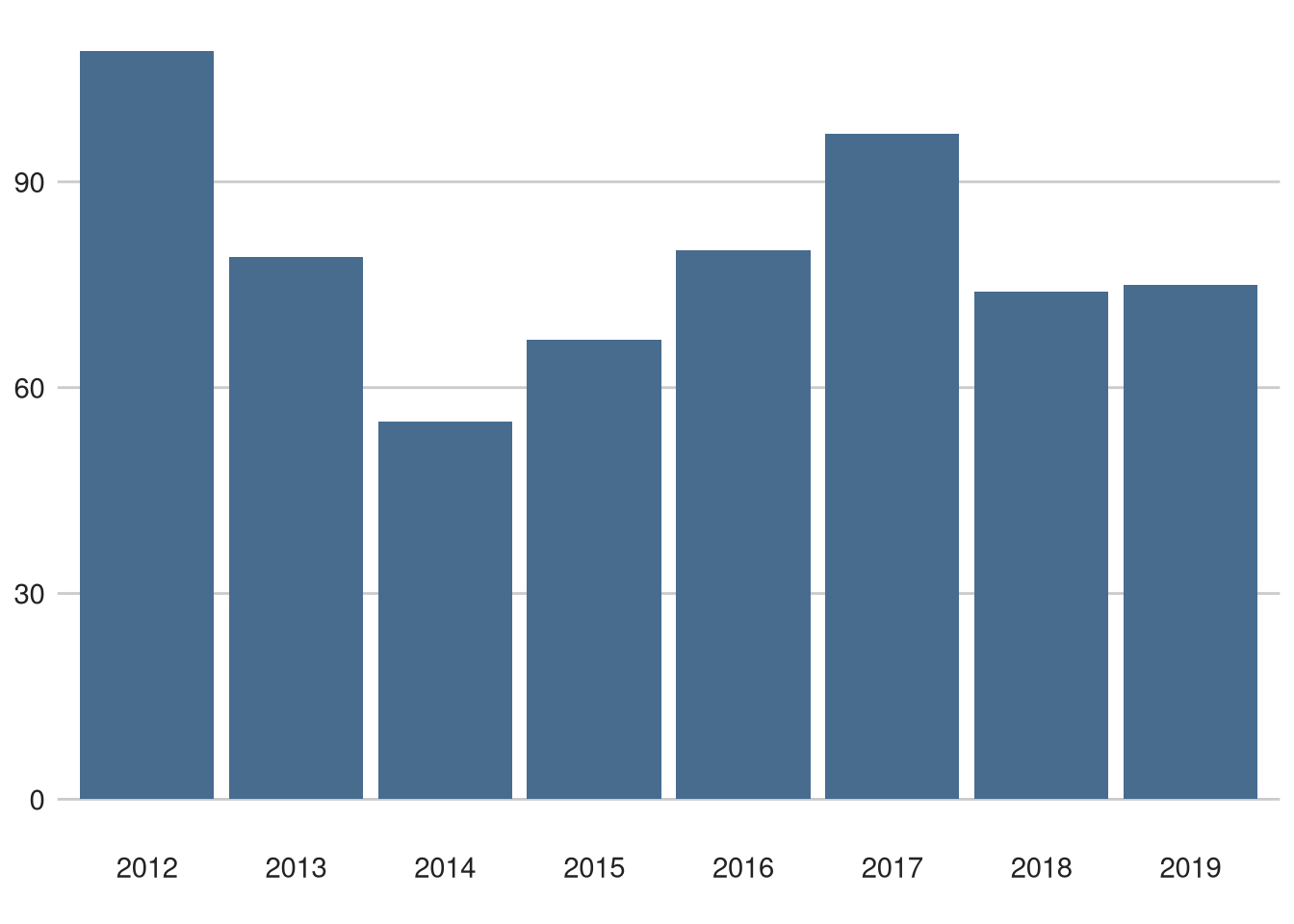
Figure 4: Top 20 riders with most did not finishes (any reason) since 2012. Only the top 20 riders is shown.
Paris Roubaix results in one figure
Figure 5: Paris Roubaix time differences since 2012
Figure 5 is most likely the most complicated figure on this page. Let’s break it down step-by-step, starting with the axes. The vertical axis contains the time difference compared to the Paris Roubaix winner. The winner, of course, arrives with a time difference of zero. All time differences are scaled with a square root, so you can properly see the small time differences close to the winner and large time differences, higher up the axis, don’t take up that much space. The horizontal axis contains the race years
Then we have dots. Actually, many of them. Each dot represents a ‘bunch’ of riders that finished at the same time. The size of the dot corresponds to the amount of riders in the ‘bunch’.
The dots are also coloured. A red dot means that this group of riders belongs to the first 10 groups of riders that reached the finish. After the 10th group the dots get coloured blue. Group of riders that finishes more than 5 minutes behind the winner are not shown. Finally, the black dots represent the riders that did not make it to the finish for whatever reason (time limit, crash, etc).
All dots should be interactive. You can hover over them with your mouse and see which riders finished within that dot and the ranking of the riders. It may be a bit more complicated to get the dots to work properly on a phone.

