
Visualizing the road to the Giro d'Italia
This is one of the times I truely deviated from my plan. There is a lot of work to do with the prediction algorithms, but instead of focusing I made a small app that can be used to visualize rider and team preparations for the Giro d’Italia. Talking about the Giro, did you already see our statistics on the Giro d’Italia race page?
Before we continue there are 2 important things:
- This app is not really suitable for small mobile devices. The resulting visualization can be pretty big, hence hard to view on smaller screens.
- You need to disable any javascript blockers (if you use any).
So let’s start with a screenshot:
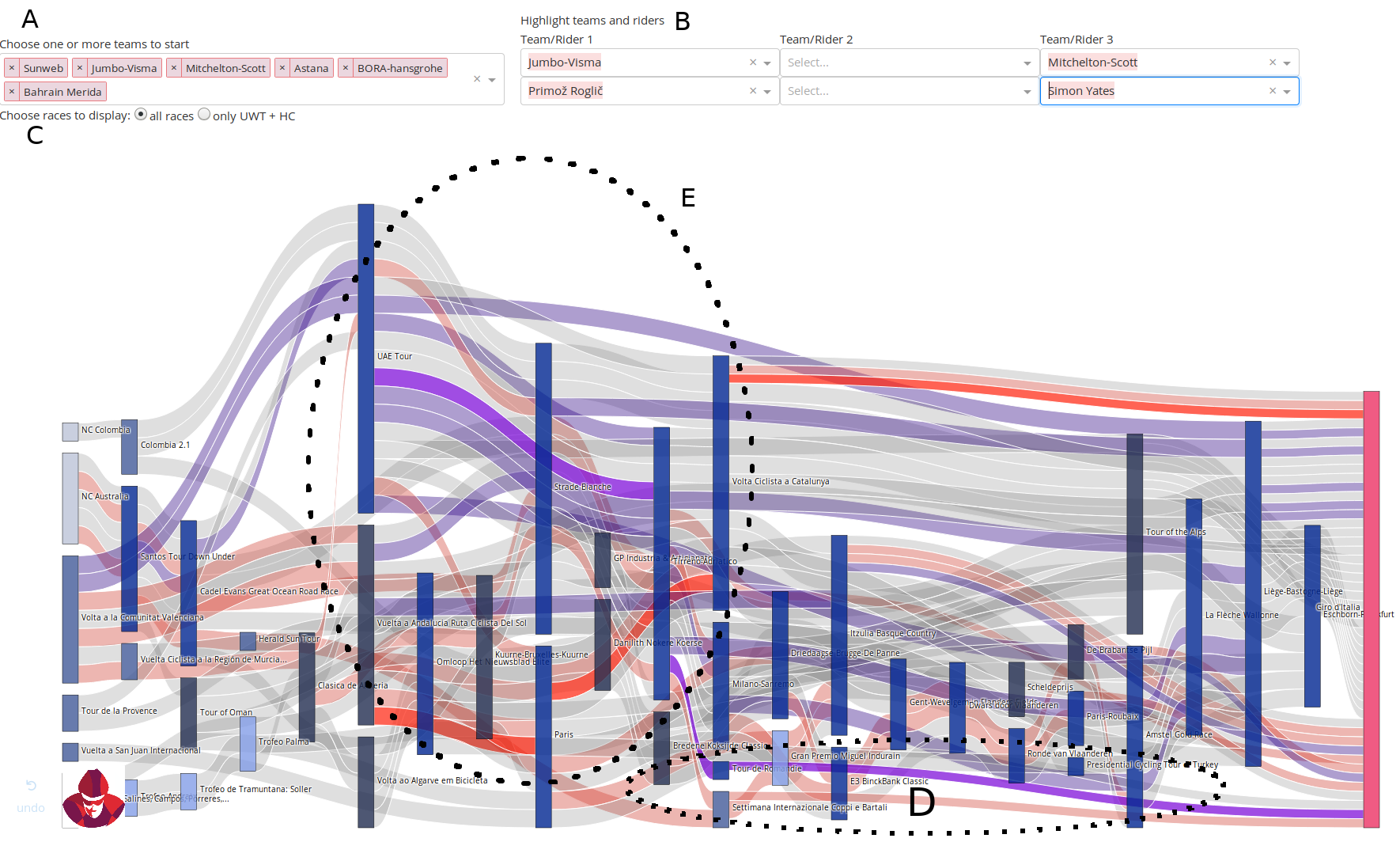
Figure 1: Road to Giro app overview
Here you see the default start position of the tool. The input settings can be changed as follows (note that the letters point to a location in the figure):
- You can change the included teams in the overview, more teams means a more crowded chart.
- You can highlight up to 3 teams and riders. The colors used are purple, green and red. If you also select a rider from a team it will be shown in a brighter shade of the color. For example, in Figure 1 you can see that I highlighted two teams. The first team (in purple) is Jumbo Visma. From this team I selected Roglič as rider. He is now represented by the darker purple stripes. The other team selected is Mitchelton-Scott (light red). The rider highlighted in the brighter shade of red is Simon Yates.
- It is possible to filter on race categories by selecting either the option ‘all races’ or ‘only UWT and HC’ races.
The figure that you see simply shows how riders ‘flow’ through the season and which races they attend. You need to pay a bit of attention, because by design riders that do not participate in a race can flow through the race. A clear example of this you see at the bottom of the figure (label D). Here Roglič leaves the Tour de Romanie and his next stop is the Giro. However, the stripe connecting the Tour de Romandie and Giro passes through three other races, including the Tour of Turkey. You may have already noticed, but races have different colors. The UWT races are blue and HC races are kind of dark grey-ish. The remaining colors correspond to races of categories 2 and 1, and national championships.
We will now zoom in on region E and explain this in a bit more detail.
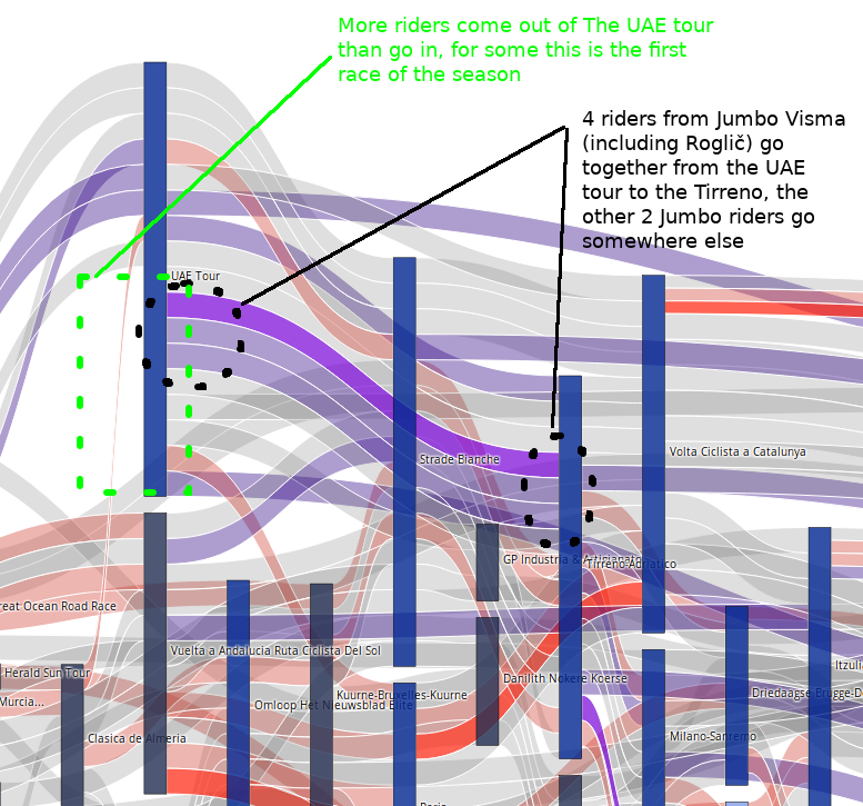
Figure 2: Road to Giro app zoom region E
In Figure 2 we zoom in on region E of Figure 1. One of the things we notice is that there are 6 Jumbo-Visma riders in the UAE Tour that later will participate in the Giro. You can see this since 6 purple stripes leave the UAE Tour bar. Of the 6 riders, 4 go afterwards to the Tirreno-Adriatico, including Roglič. Furthermore you notice more riders leaving the UAE Tour than come in. This is because for some riders the UAE tour is the first race of the season. As the season progresses the input and output of races will be balanced.
You can easily observe another thing from these charts. That is how ‘popular’ a race is in the preparation. Take for example the Tour de Romandie in region D of Figure 1. Of the selected teams (6 in total, see letter A), only 2 riders chose to ride the Tour de Romandie before the Giro. One of them was Roglič who also took the GC victory.
Do you want to try it yourself? Click below to start the app. The app uses free hosting, so I’m not sure about it’s performance when many people would use it at the same time. Furthermore, if the image does not show close the app, make sure all javascript is enabled and re-open it.